I struggled with this assignment because of the picture I was required to use. The assignment was to create a flyer. For work, we host pizza parties to encourage students to schedule their exams and have adopted the “Pizza Cat” as a marketing strategy. Shown below are some of the versions to show that while I do not love the final product, it is an improvement over earlier work.
I used the The Works-Every-Time Layout Tutorial for new graphic designers.
Attempt 3 (Failure)
- I disliked the simplicity of the layout as it made the flyer look juvenile.
- I needed something to use the space on the bottom left corner. I thought that using a different Pizza Cat would help but it didn’t.
- Overall, this is just ugly.
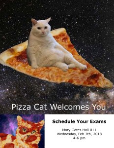
Attempt 6 (Failure)

- I liked the cleaner feel of the flyer, by keeping the one image as the only image on the flyer.
- I waned to include some repetition and thought that having a black/white “pizza cat” would help. It didn’t.
Attempt 11 (Success)

- I thought that adding a joke added some interest, and kept what Pizza Cat represents (ridiculousness and light-hearted humor).
- Admittedly, I did not know what else to do about the empty white space at the bottom, and did not want to introduce any new images. Adding smaller, repetitive images of the main focus, (again), adds to the fun. This also highlights the importance of this message – the day, time, and place of the exam scheduling pizza party.